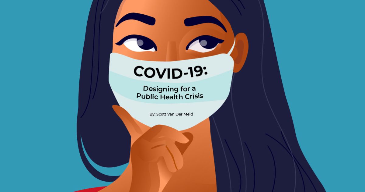
Graphic design and visual imagery are critical not only to communicating messages but also to inspiring and motivating people to change the way they think and act. From the “We Can Do It” Rosie the Riveter image promoting women in the workforce during World War II to the “Silence = Death” poster seen everywhere in the early days of the AIDS epidemic, design has the power to inform, elicit emotion, and drive social change.


We’re seeing the power of design at work during the COVID-19 crisis to communicate urgent public health information that helps keep people safe and control the spread of the virus—such as wearing a mask, staying home, handwashing, and social distancing. Let’s take a look at some creative and effective design solutions that help express these messages.
Wear a Mask
Face protection limits the spread of COVID-19 and has become our new normal. But how do you demonstrate that message visually in a way that’s memorable, compelling, and resonant across language barriers? Take a look at this image created by Sumanley Xulx from Pixabay.

Why it works:
By adding a mask on the Mona Lisa—one of the most recognizable paintings in the world—this example needs no words to communicate “the new normal.”
Stay Home
Public health officials encourage staying home as much as possible. In response to the Stay at Home directive, Instagram created a branded sticker for user’s stories.


Why it works:
The sticker’s appeal lies in its graphic simplicity. By merging two iconic symbols—a home and a heart—the designer conveys that staying at home equates to safety and well-being. Additionally, there’s an implied smile at the base of the heart where the roof breaks the plane, reinforcing good health and happiness at home. The symbol is even powerful enough to stand alone without any typography. Instagram users who stay at home can use this as a badge to show they’re doing their part for public health.
Wash Your Hands
According to the CDC, proper handwashing technique has proven to reduce the spread of diseases by up to 58%. It requires just 20 seconds and thorough scrubbing of palms, backs of the hands, wrists, in between fingers and thumbs, and fingernails.

Why it works:
Although this illustration by Mila Olszewska incorporates captions, even non-English speaking audiences can still understand the infographic. Arrows and the eight-step process break down handwashing into easy to follow steps.
Social Distance
Some of the world’s best-known brands are modifying their iconic logos to promote social distancing—and breaking their own brand standards to make this point.


Why it works:
Like the masked Mona Lisa, these logos take widely recognized images and reimagine them as visual reminders to stay apart. The captions thank the reader for protecting public health. For someone walking down the street or watching a commercial, they serve as a reminder to be conscious of the actions needed to prevent the spread of COVID-19.
Through creative design, we can remind viewers of the steps they need to take to keep us all safe. Want to create behavioral change through graphic design? Contact LMD.

