In 2017, I posted my blog, “Is It Time for a Rebrand? 3 Ways to Know.” Since then, LMD has gone through leadership changes, rapid growth, and—yes—a rebrand. Like any organization, our capabilities and expertise continue to evolve and shift. And so I bring you “Is It Time for a Rebrand? 3 Ways to Know,” rebranded.
In the past seven years, LMD has become a resource for government agencies looking to rebrand. We have created brands for the U.S. Coast Guard’s recruiting efforts, the Office of Personnel Management, the Small Business Administration, and the Department of Energy, and more are on the way. On the surface, the decision to brand or rebrand a government agency is no different than rebranding another organization. To quote my previous blog,
“Here’s one of the toughest questions we ask our clients when they are considering a rebrand: “Does your company’s brand accurately represent your culture, purpose, and promise?”
This holds true for federal agencies as much as it does private companies. Missions evolve, audiences change, and new needs arise. Here are three reasons it might be time for a federal agency to rebrand or refresh.
1. Your audience is evolving, and you want to meet them where they are.
With over 230 years of history, it’s safe to say the U.S. Coast Guard’s recruiting audience has changed a bit since 1790. To continue attracting talent, they needed to develop a modern, refreshed recruiting brand that resonates with the current generation.
Rebranding the Coast Guard’s recruiting efforts meant doing extensive research to understand their target audience’s (primarily 18 to 25-year-olds) goals, preferences, and desires. After extensive qualitative and quantitative market research, a brand emerged that emphasized the humanitarian focus at the heart of all Coast Guard missions. For a modern audience driven to make a positive impact, the new brand and tagline—”Protect, Defend, Save”—resonated deeply. The result is a brand that invites the next generation to carry on the Coast Guard’s 235-year tradition of service.
The U.S. Coast Guard’s recruiting rebrand, sponsored by Admiral Linda Fagan, their first female commandant, integrates patriotic symbols like the bald eagle and star with nautical elements such as life rings and waves. The new branding captures the essence of the Coast Guard's domestic and maritime missions and the theme of protection and lifesaving.
2. You want to build awareness.
When market research revealed that audiences were not aware of the Small Business Administration’s (SBA) value and full scope of services, the SBA was challenged to increase its brand’s relevance among small business owners and entrepreneurs.
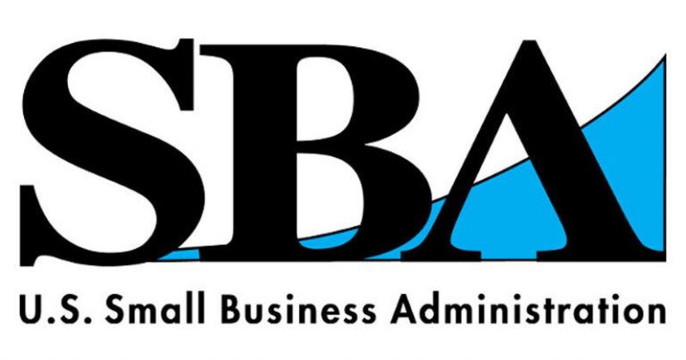
The SBA is far reaching, with 10 districts and 74 field offices throughout the U.S. and Puerto Rico. LMD designed and implemented a comprehensive, enterprise-wide rebranding initiative that blended change management and branding strategies to increase awareness and understanding of the SBA and its value, as well as increase use of the SBA’s programs and services among small businesses and entrepreneurs. The new SBA logo symbolizes SBA’s role as a critical resource to help the nation’s small business owners achieve their goals and dreams.

The logo features an upward arrow, symbolizing how the SBA empowers small businesses and entrepreneurs to push boundaries and reach their full potential. It represents the SBA’s role in opening new markets, pioneering technologies, and providing the support needed for growth. The bold capital letters convey strength, while the centered “B” highlights the customer-centric focus. A subtle dollar sign suggests the SBA’s role in securing capital, and the turned corner represents its function as a catalyst for business growth and success. The colors red, white, and blue need no explanation—it’s an American agency, for the American dream.
3. Your organization has big goals, and you need a brand to match.
The U.S. Department of Energy (DOE)’s Office of Public Affairs (PA) wanted to refresh the agency’s brand to illustrate its role as a champion of our nation’s energy economy, a protector of energy security, and a leader in clean, equitable energy solutions and innovative scientific discoveries. They needed a brand as inspiring and energizing as their mission and vision for the future.
LMD gathered insights and feedback from DOE employees and key stakeholders and conducted a brand audit to understand current perceptions of the agency. Using the collected data, LMD created a modern, eye-catching logo that reflected DOE’s past and future and positioned DOE as “one agency.” But visuals weren’t the limit—a sonic brand added to DOE’s brand experience.
The logo uses color strategically to symbolize different energy sources: dark electric blue represents electrical current; aqua blue reflects water, air, and sky, generating wind and hydropower; sunglow yellow stands for solar energy; and verdant green symbolizes land-based energy sources like geothermal and bioenergy. The cutout between the "E" and "R" represents innovation and the DOE's history of advancing science, and reinforces America's leadership in energy and technology.
Ready to rebrand? LMD has extensive experience in commercial, federal, and higher education branding. Learn more.

